


Pace+ Performance Skincare
Introduction
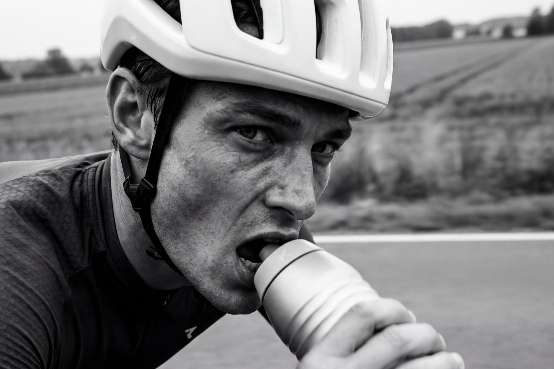
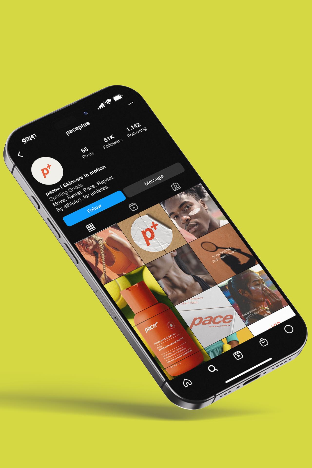
Pace+ begins with a bold, athletic visual language — a system built around clarity, movement, and impact.
The identity draws from sport culture and outdoor intensity, translating performance into a confident and adaptable brand mark.
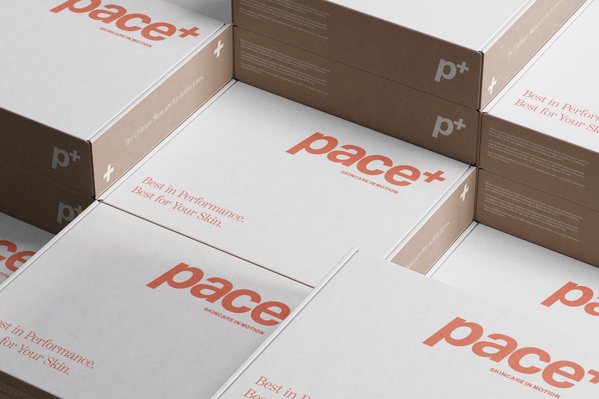
From logo variations to a high-contrast color palette, the foundation is modular and flexible.
Each element is engineered for visibility across packaging, digital, and large-scale outdoor applications.
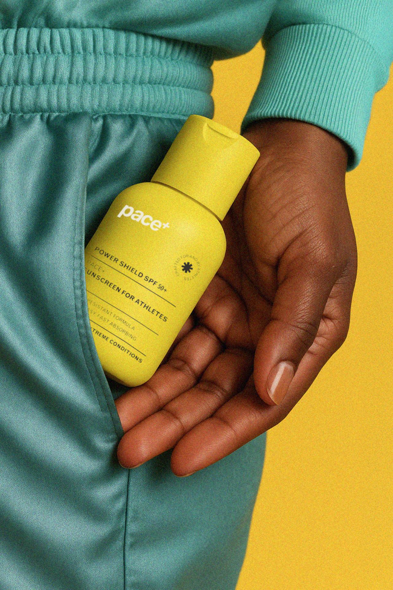
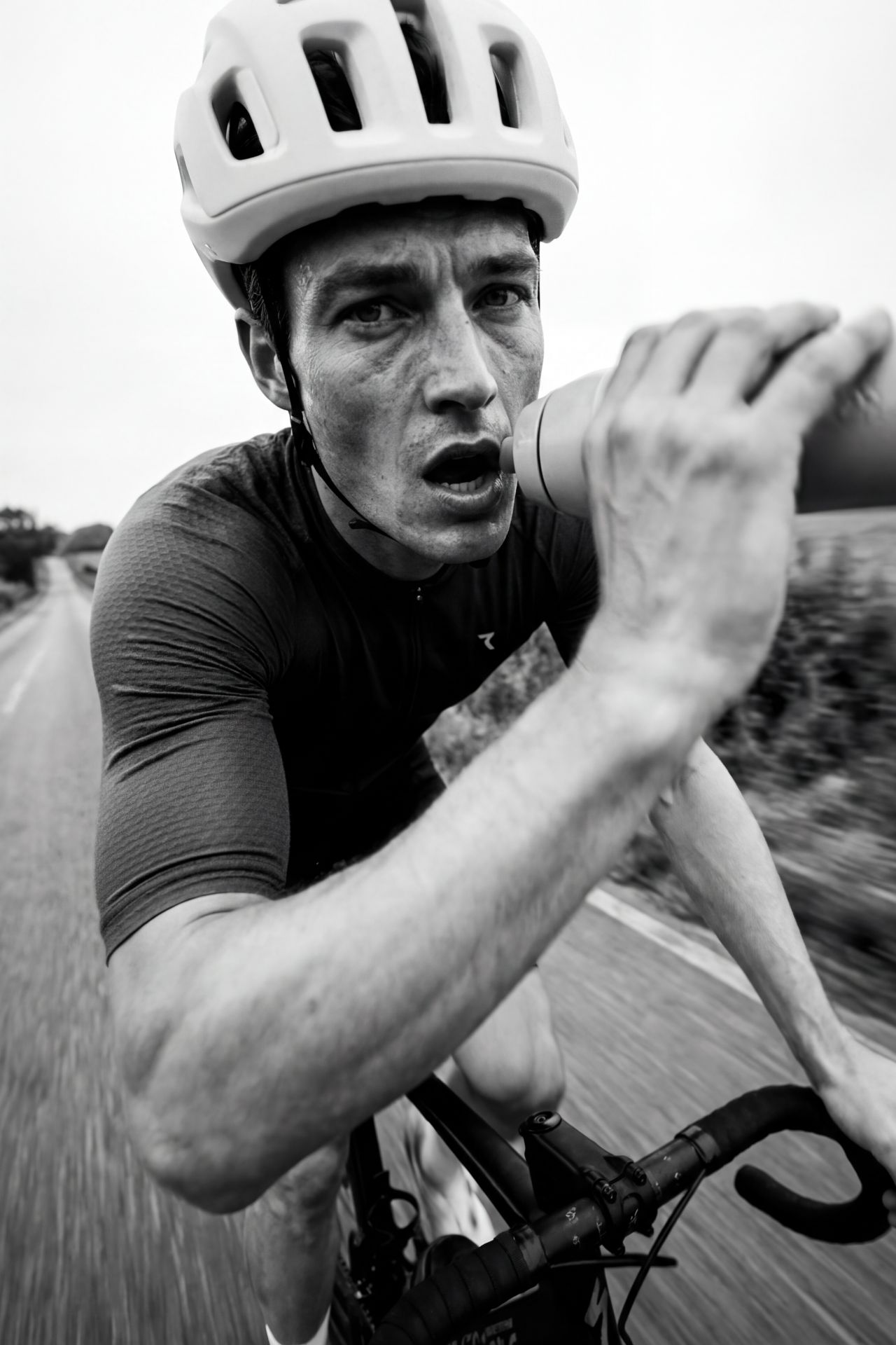
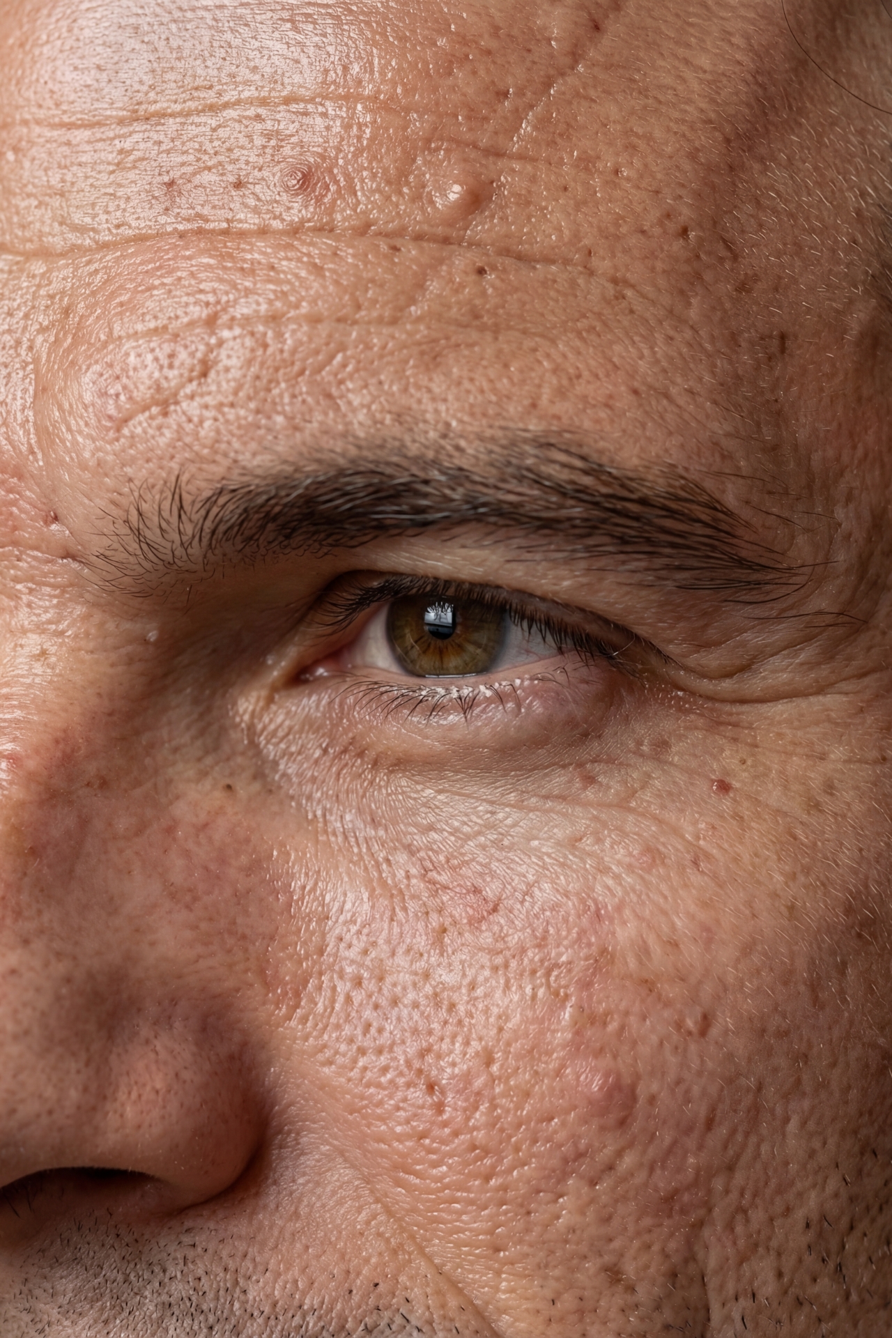
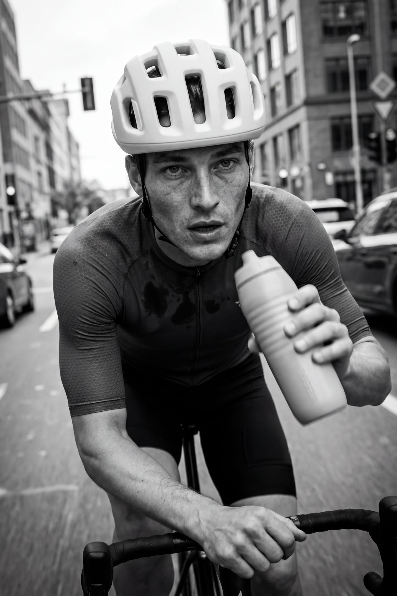
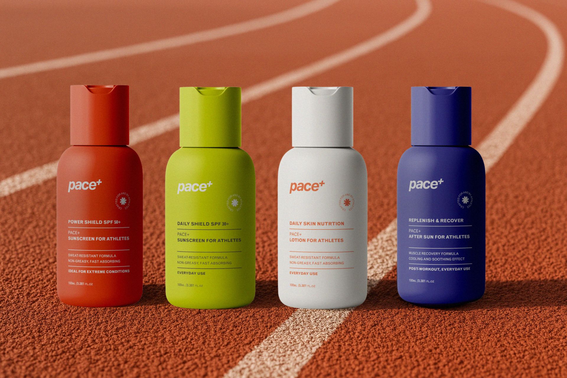
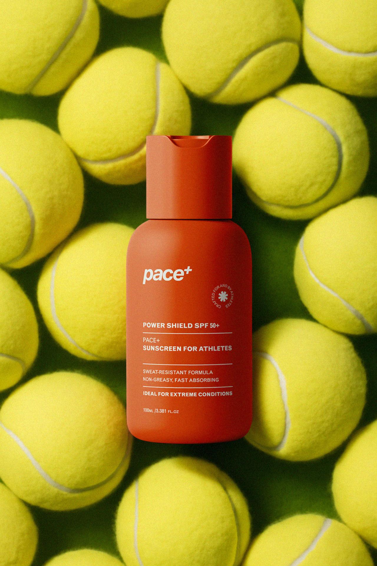
The packaging system prioritizes durability, legibility, and immediate recognition.
Strong silhouettes and monochromatic containers create a cohesive lineup made for sun, sweat, and repetition.
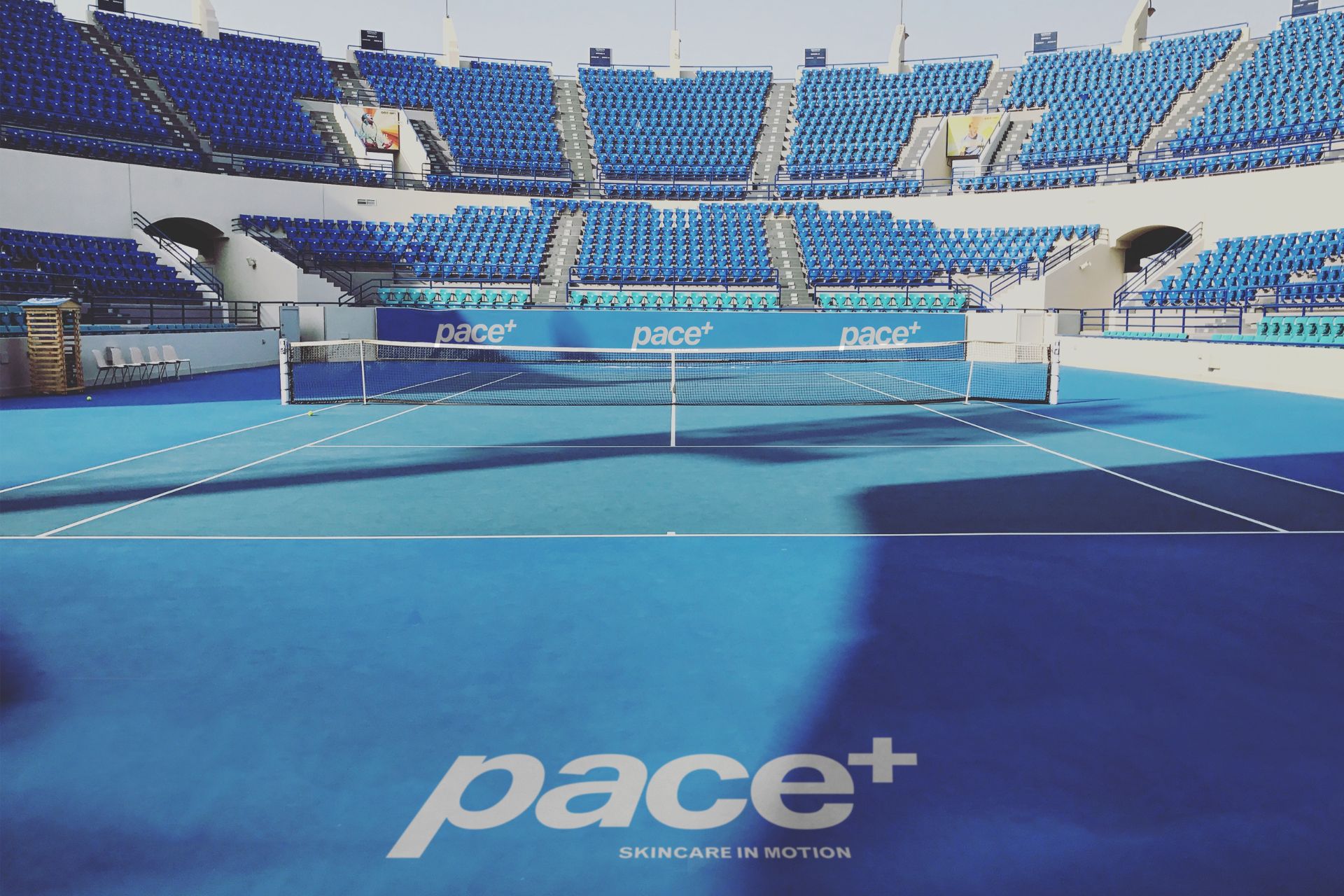
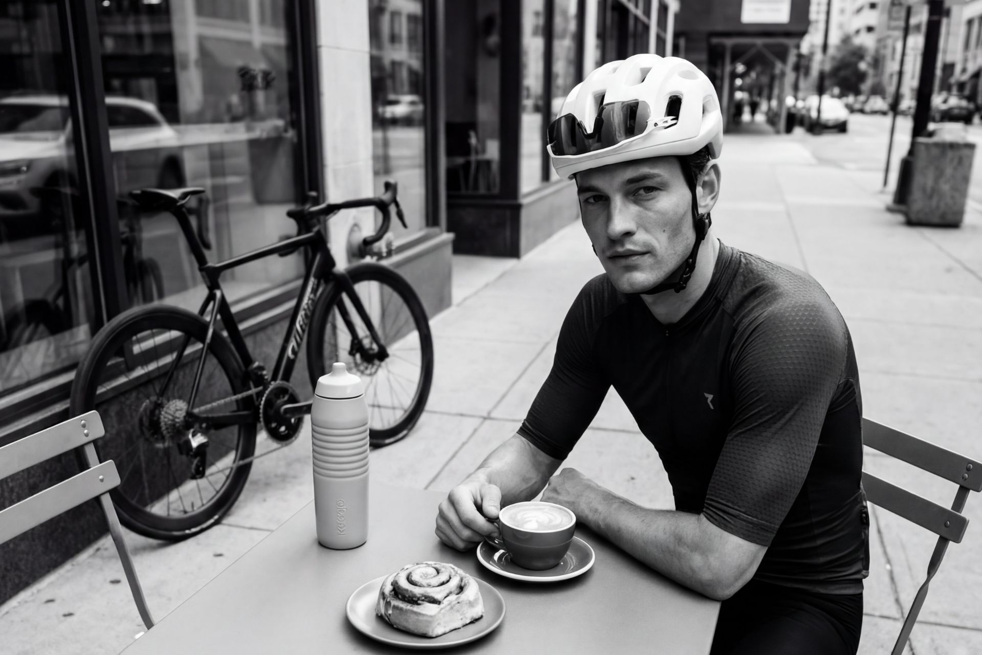
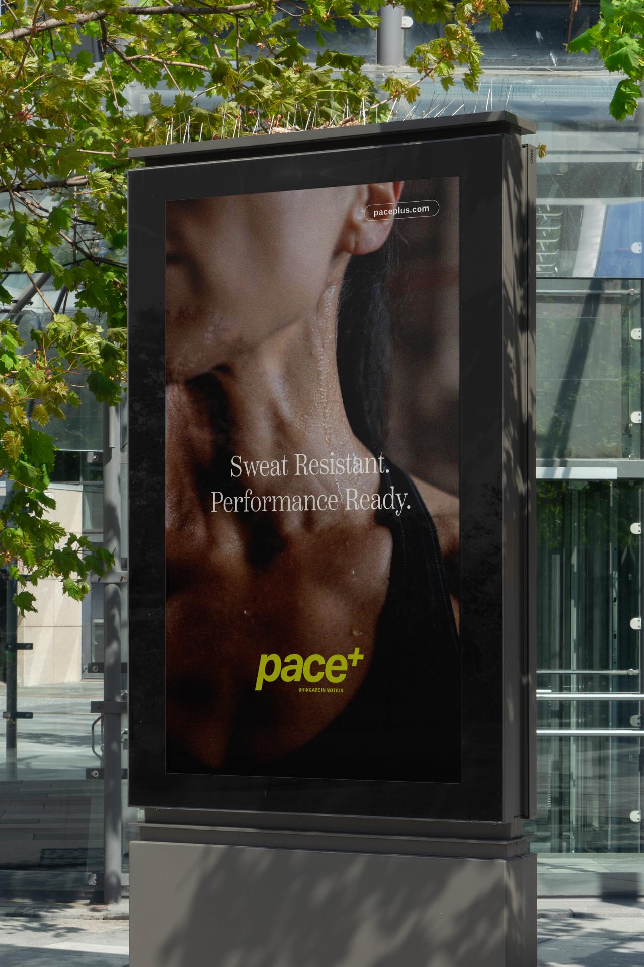
Pace+ moves beyond product and into athletic space.
Court branding and transit placements integrate the identity directly into the rhythm of training and competition.
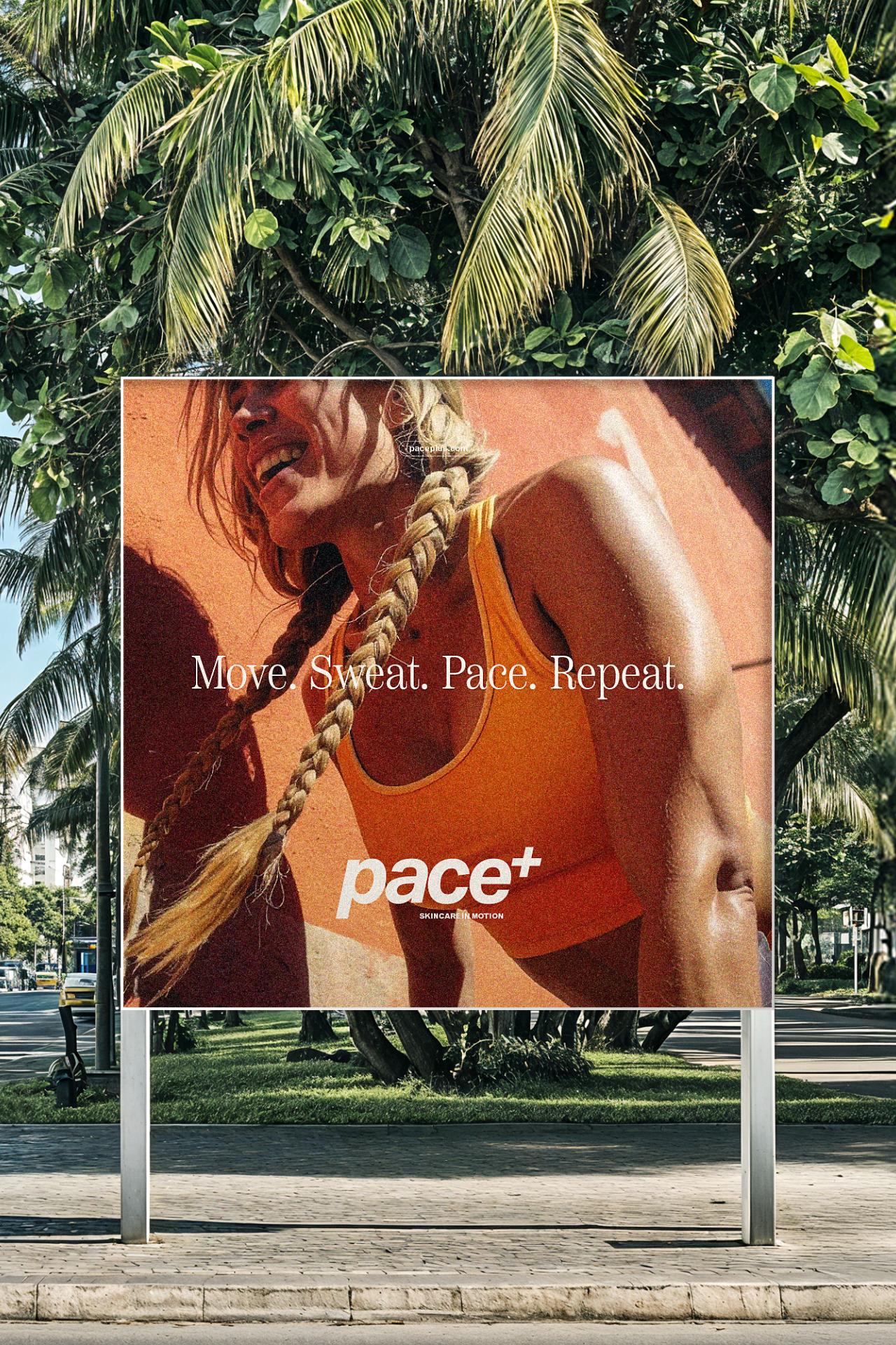
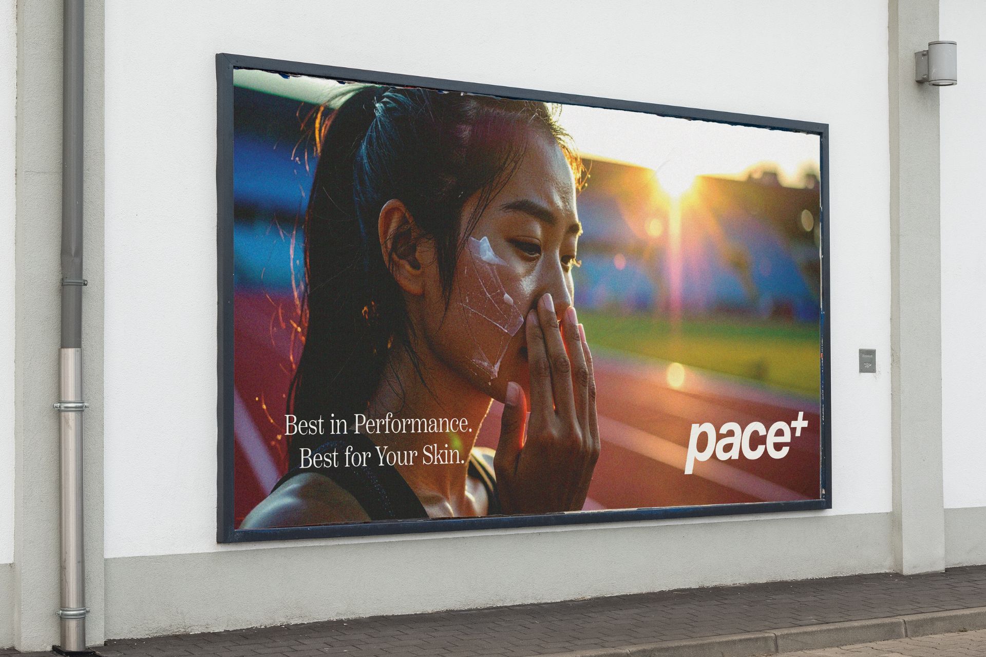
Large-format campaigns amplify the brand’s message across urban and outdoor landscapes.
From billboard to digital feed, the system remains consistent — bold, resilient, and in motion.